Death Valley Black and White
These images are direct scans from TMAX 100 4x5 negatives, made on the Epson V800.
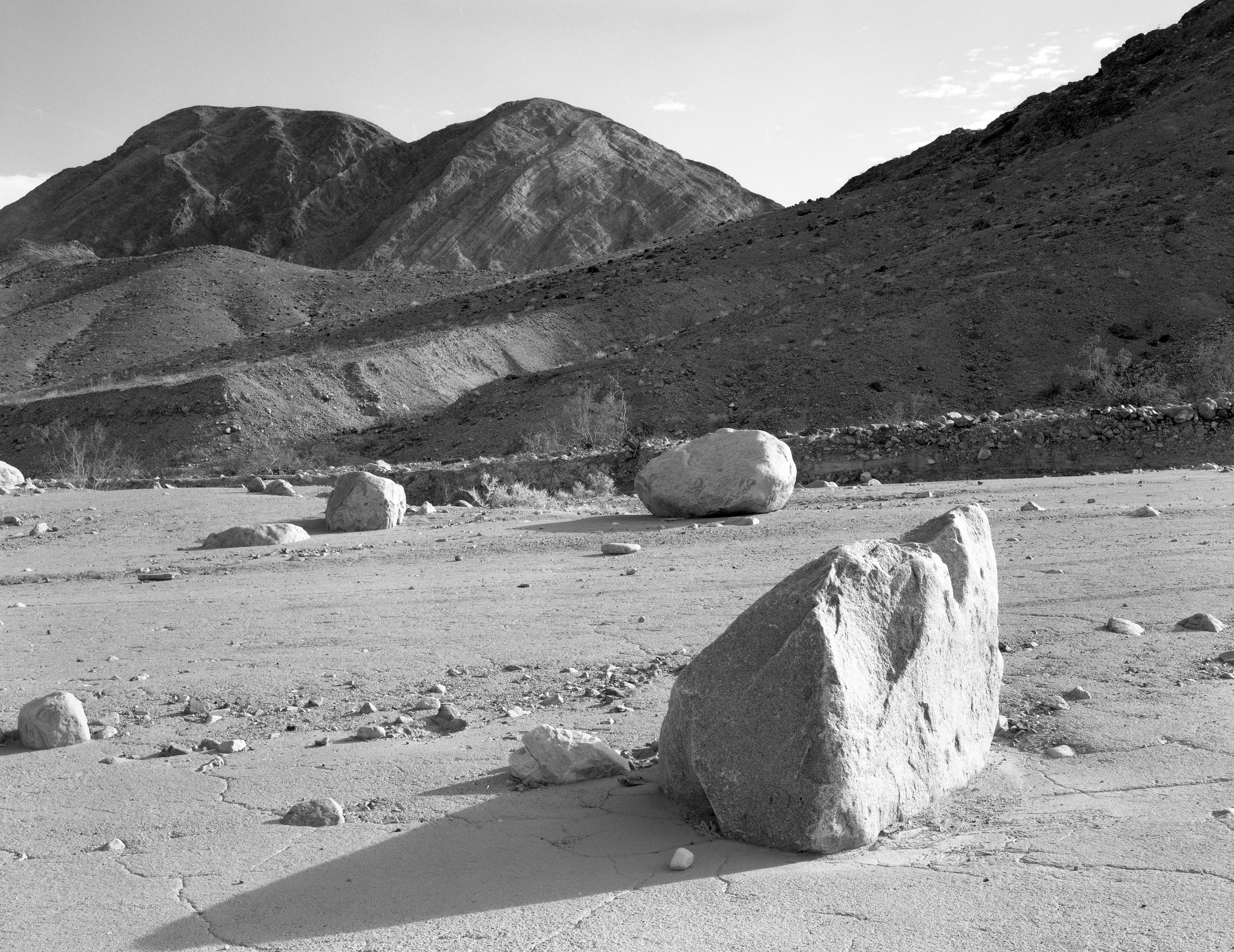
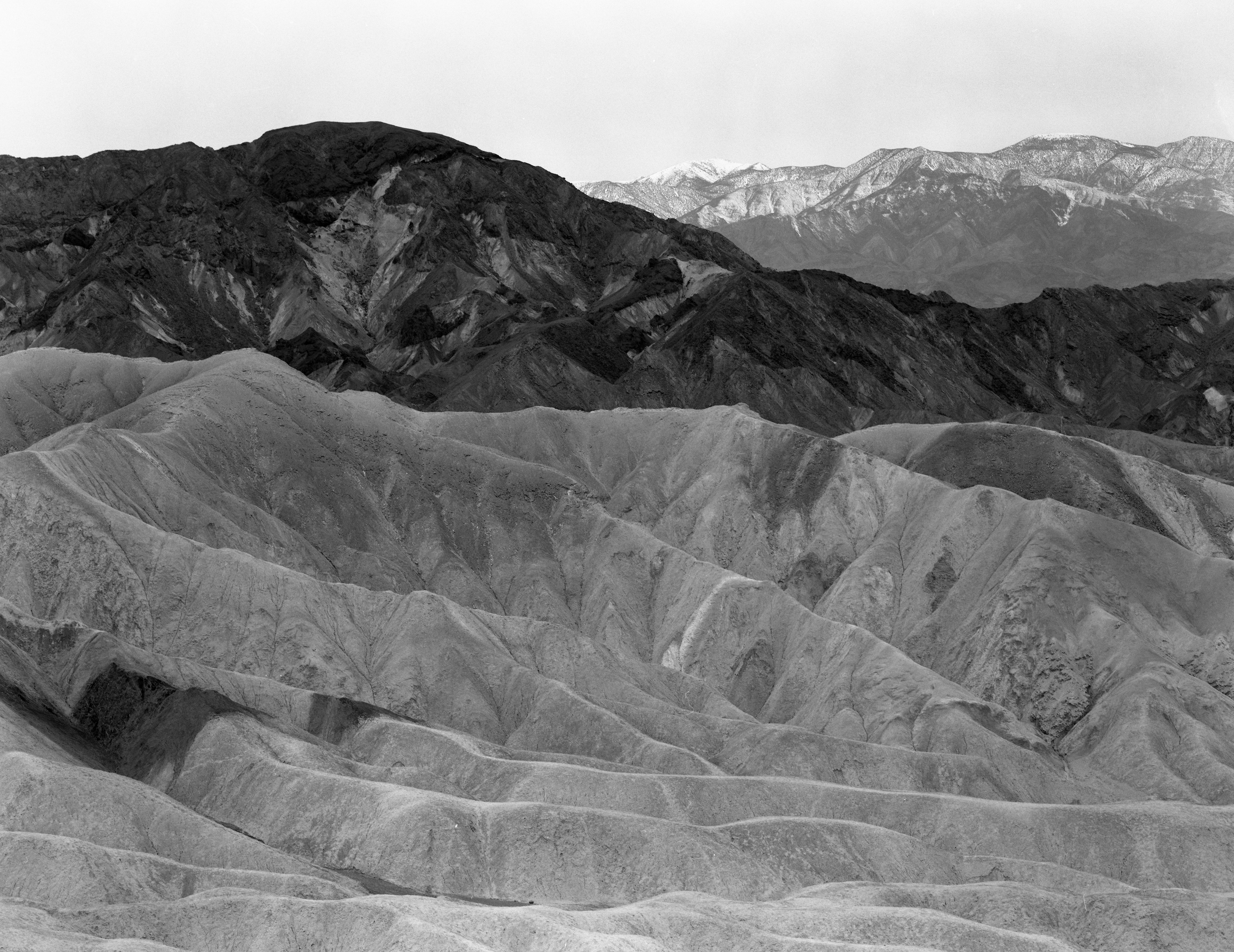
1. Marble Canyon
Lynn: Very nice but there are 2 things that bother me. The large boulder shadow is slightly cut off at the bottom. This would have been greatly improved by pointing the camera further down (less sky, and include all of shadow). There is a bright boulder cut in half on the left edge, and the other small boulder closer to the foreground needs a little more breathing room (or eliminate entirely). To preserve the nice tactile shadow values in the mountains, a SCIM mask would work wonders if you can't print the good values that I see in the computer screen. You might want to rotate the camera slightly counter-clockwise as well.
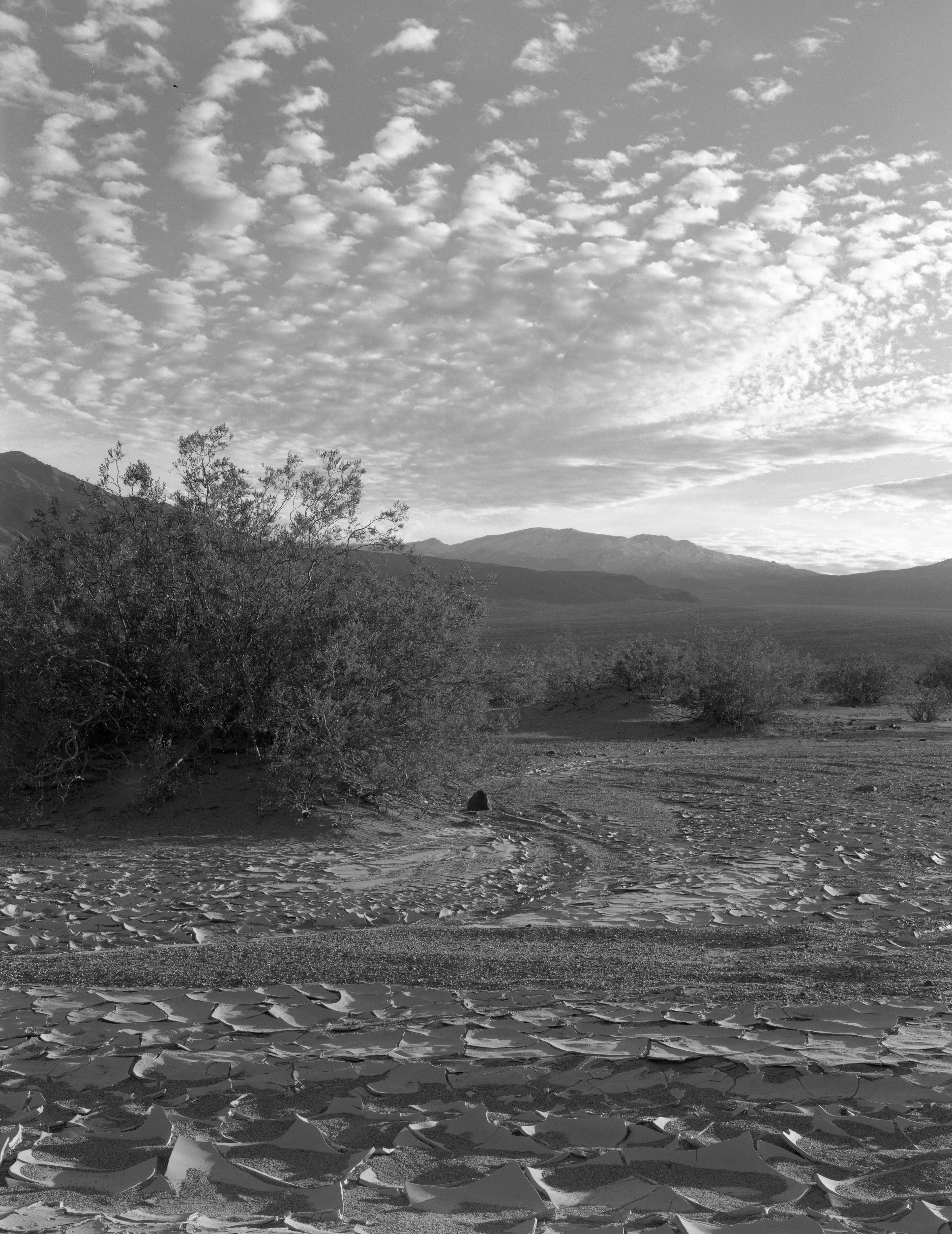
2. Creosote and Mud, Marble Canyon
Lynn: I think I like this B&W more than the color. If anything, a mild CRM mask would open-up the creosote bush shadows and add a touch of sharpness overall, without affecting the sky.
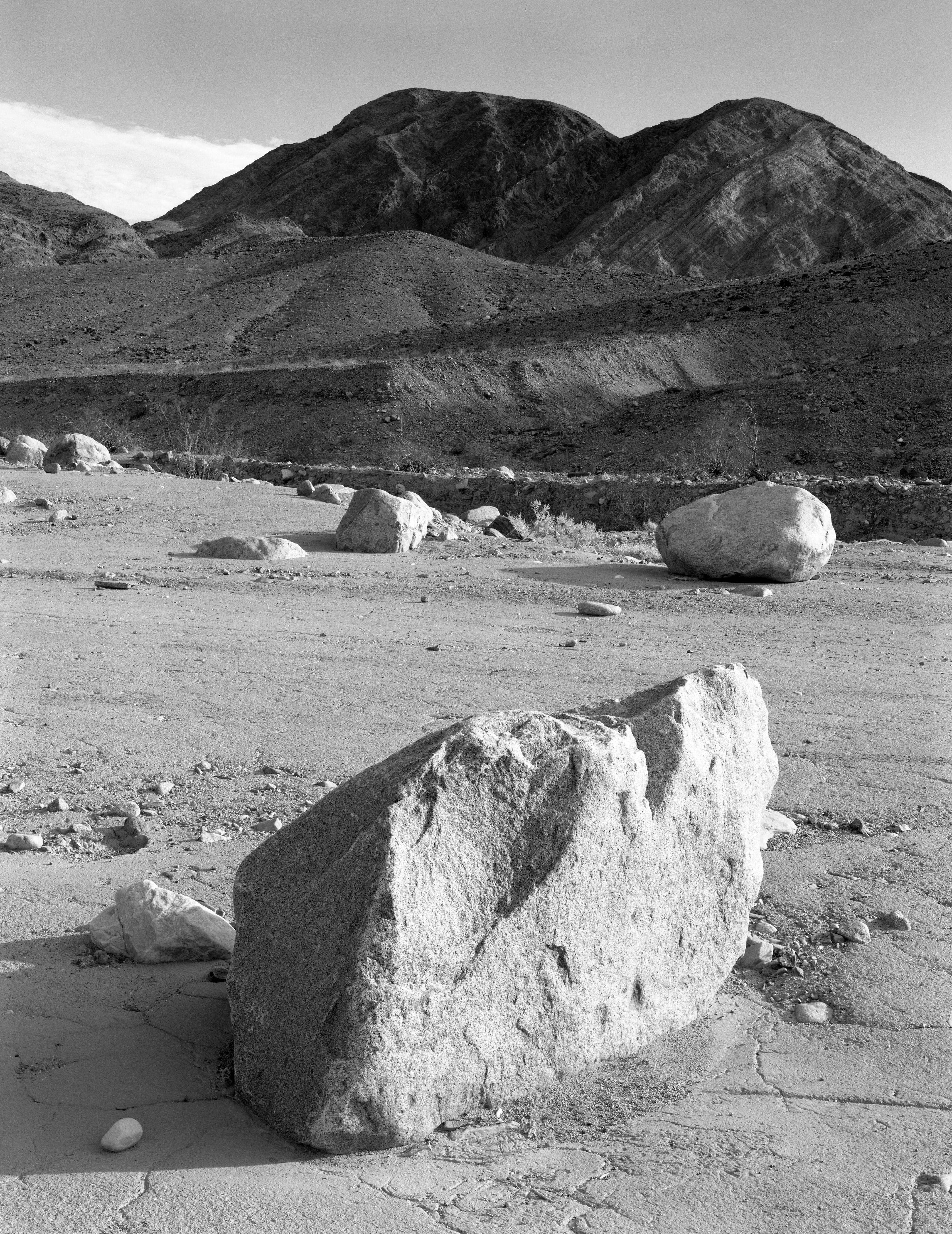
3. Boulder, Marble Canyon
Lynn: I really like this one. If anything, maybe crop in just a little from the left, and/or burn down the small left side boulder in the distance with a soft filter, or better yet a Fog Mask. The objective is to reduce any bright highlight values from competing with the main boulder. I would also use the Fog Mask on all the other boulder highlights but not the main boulder.
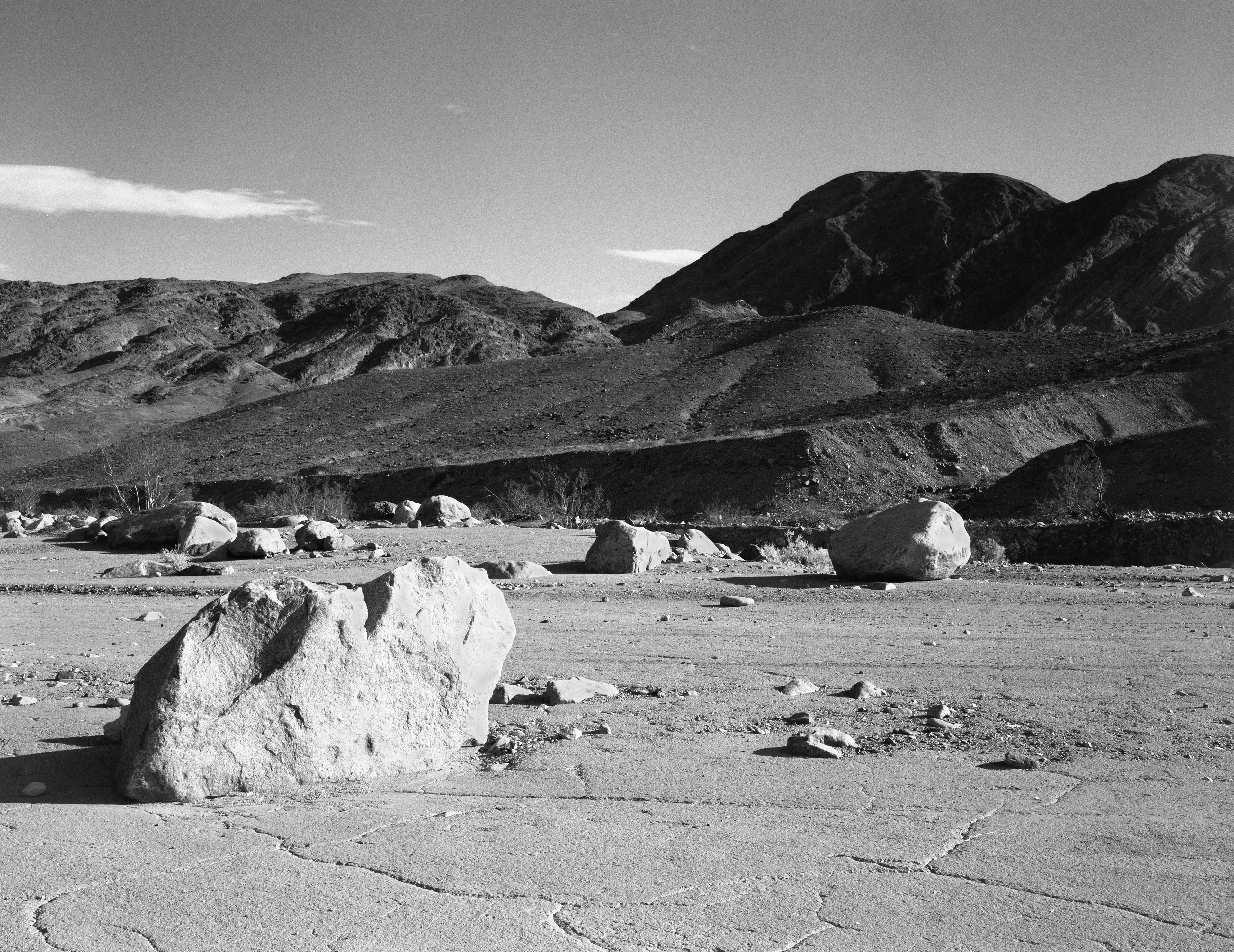
4. Boulder, Marble Canyon
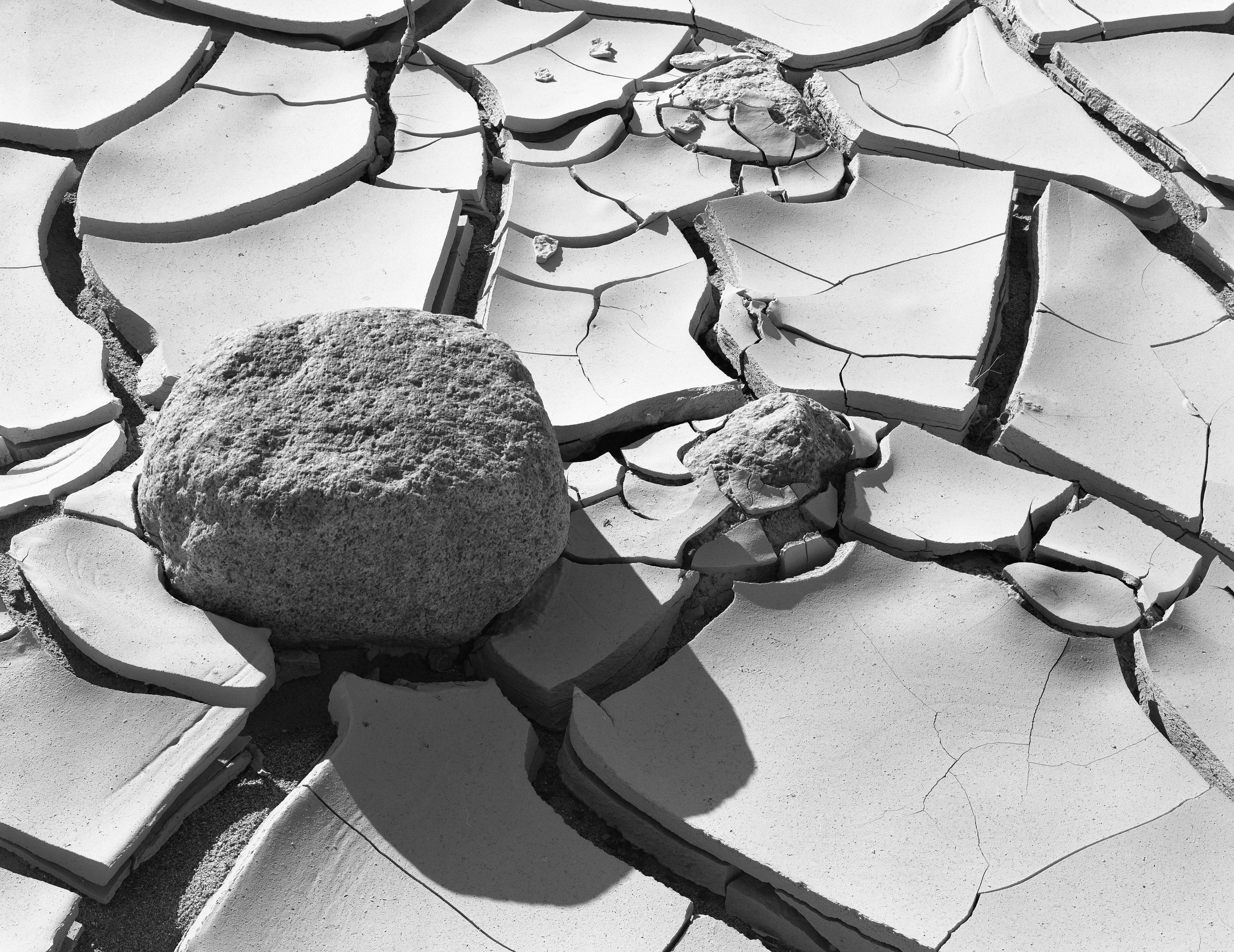
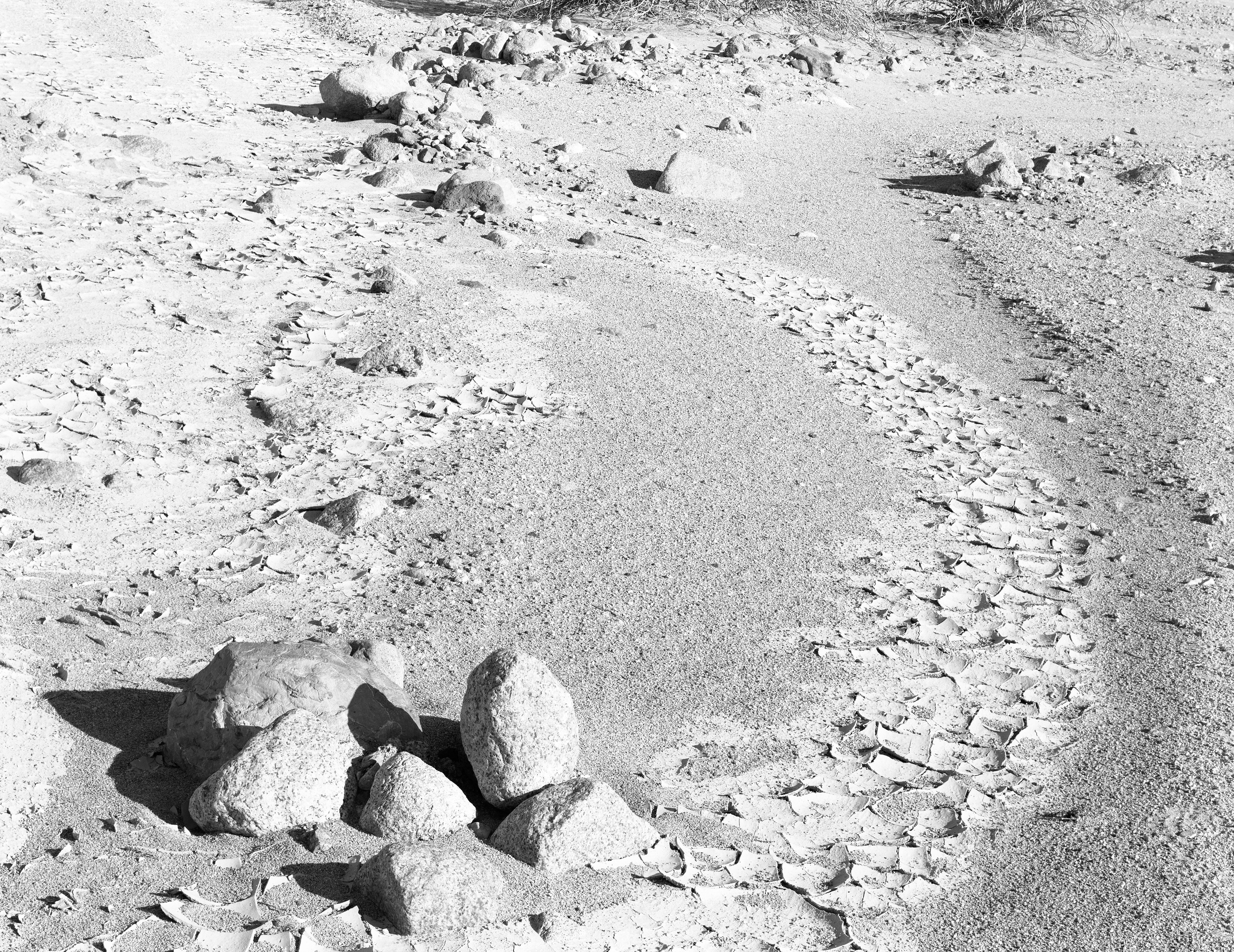
5. Mud and Rock, Death Valley
Lynn: Good as is but needs edge burning probably with a soft filter. You could really do wonders with the shadow values by using a very mild CRM then a slight bump exposure with a SCIM, but only if you're not 100% happy with the print values obtained by standard methods (dodging/burning, different contrast filters, pre-exposing areas of the print, altering developer and/or paper, etc.)
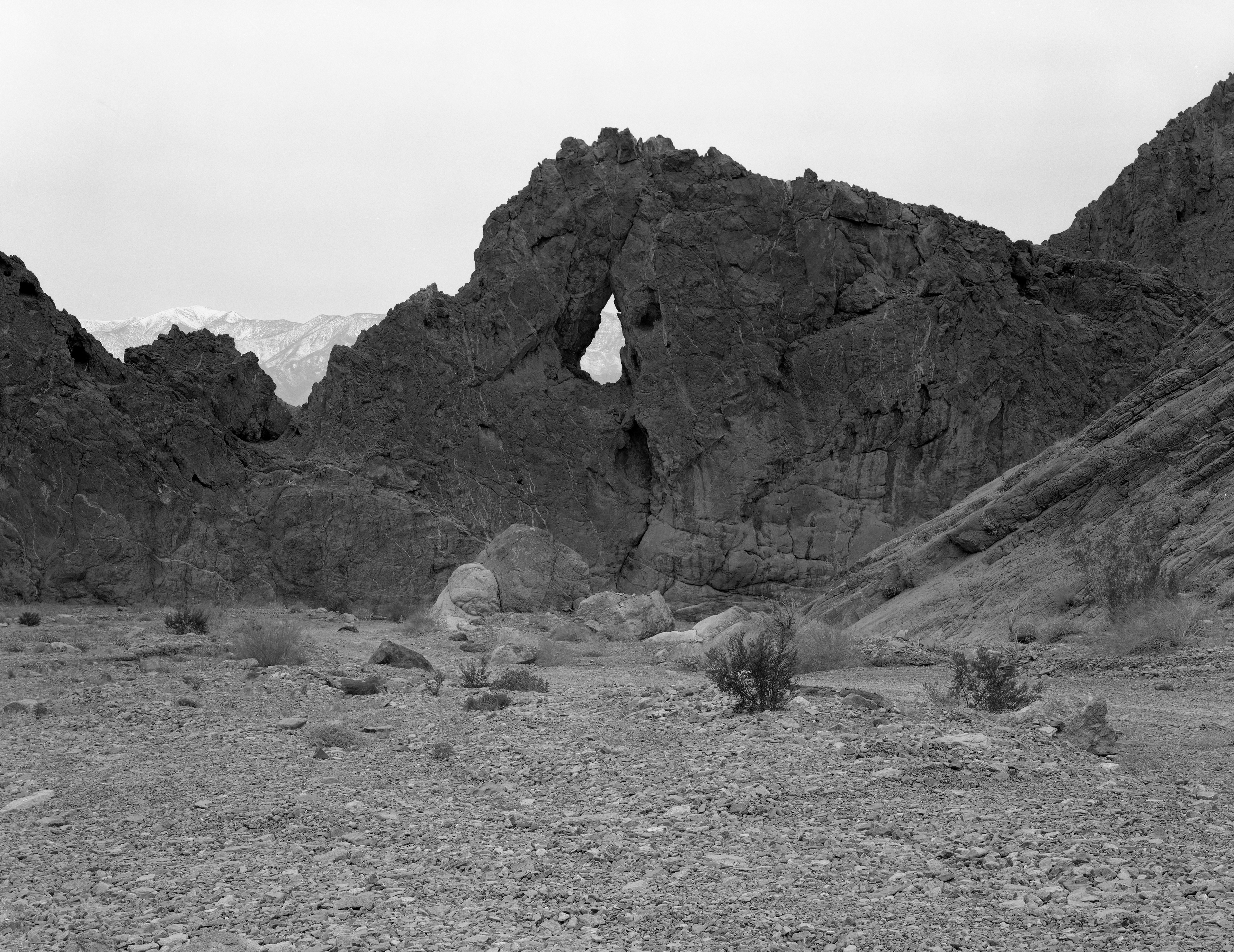
6. Eye of the Needle, Echo Canyon
Lynn: Needs edge burning, especially sky and bottom. You can have fun with various interpretations of this image. Looks like your neg exposure is excellent.
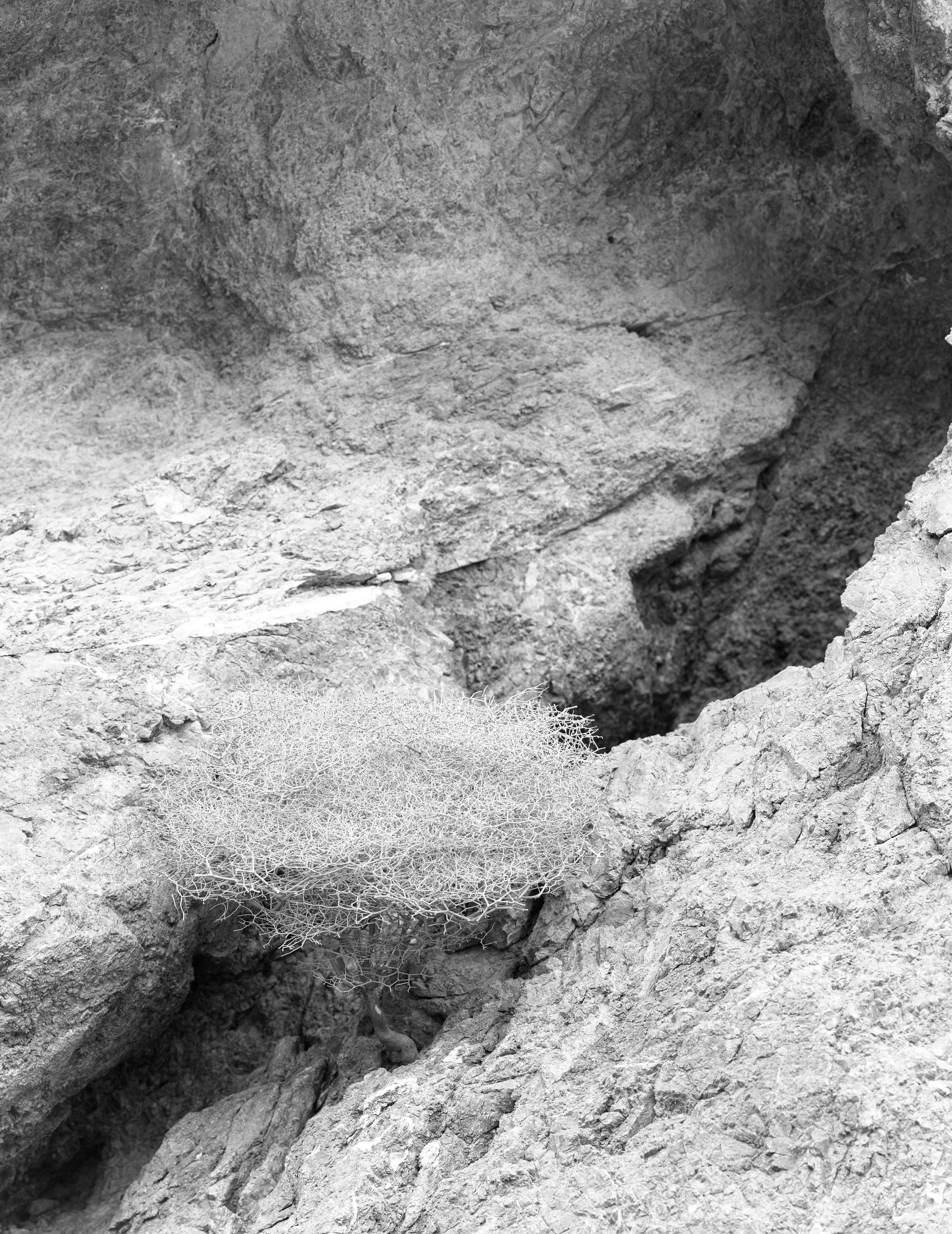
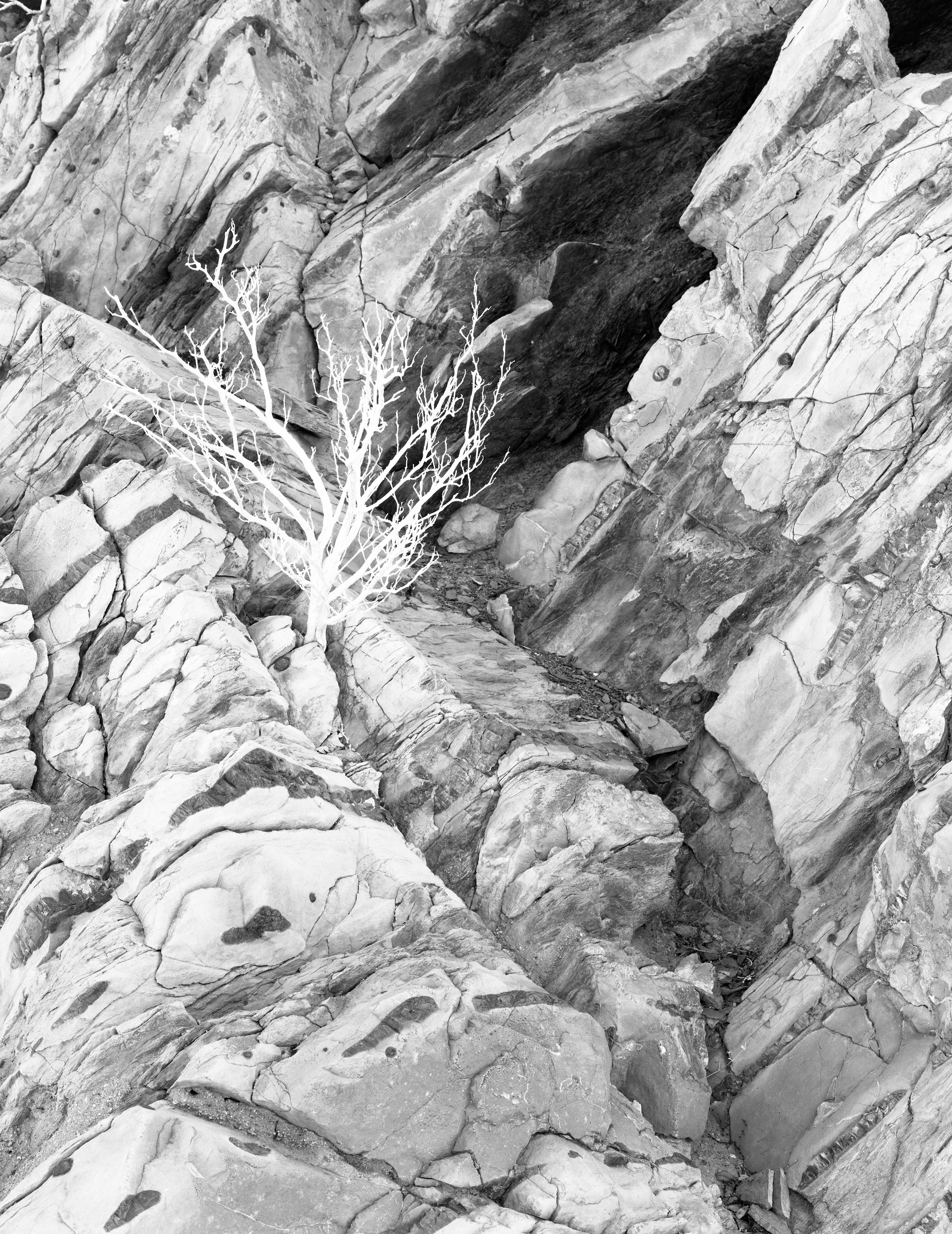
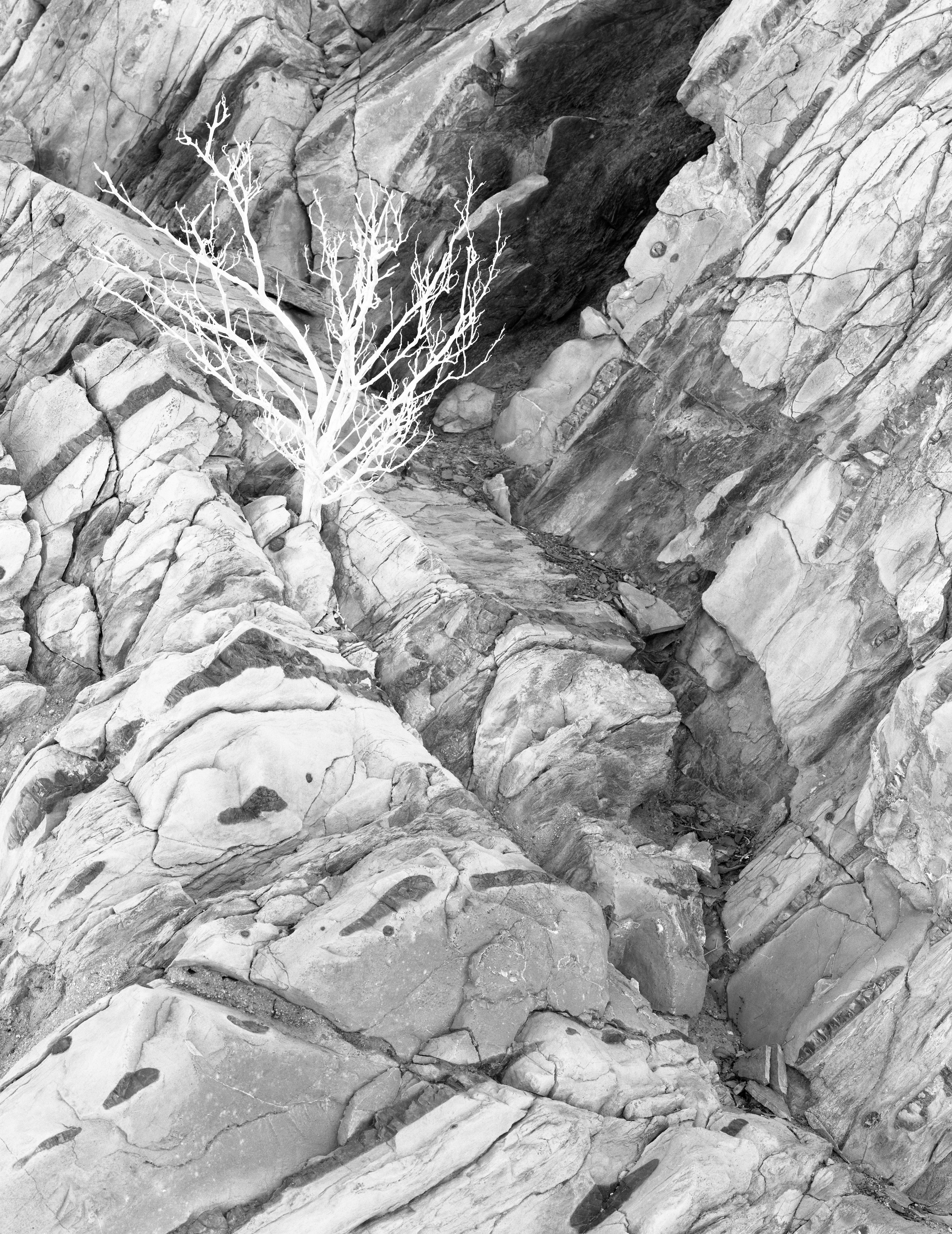
7. Bush in Cliff, Echo Canyon
8. Bushes and Cliff, Echo Canyon
Lynn: I would rotate the image slightly clockwise but the dark bush right against the right edge needs more breathing space. Also the top left edge doesn't look sharp. Print could go darker, and the bottom can be burned substantially with softer filtration (lower contrast).
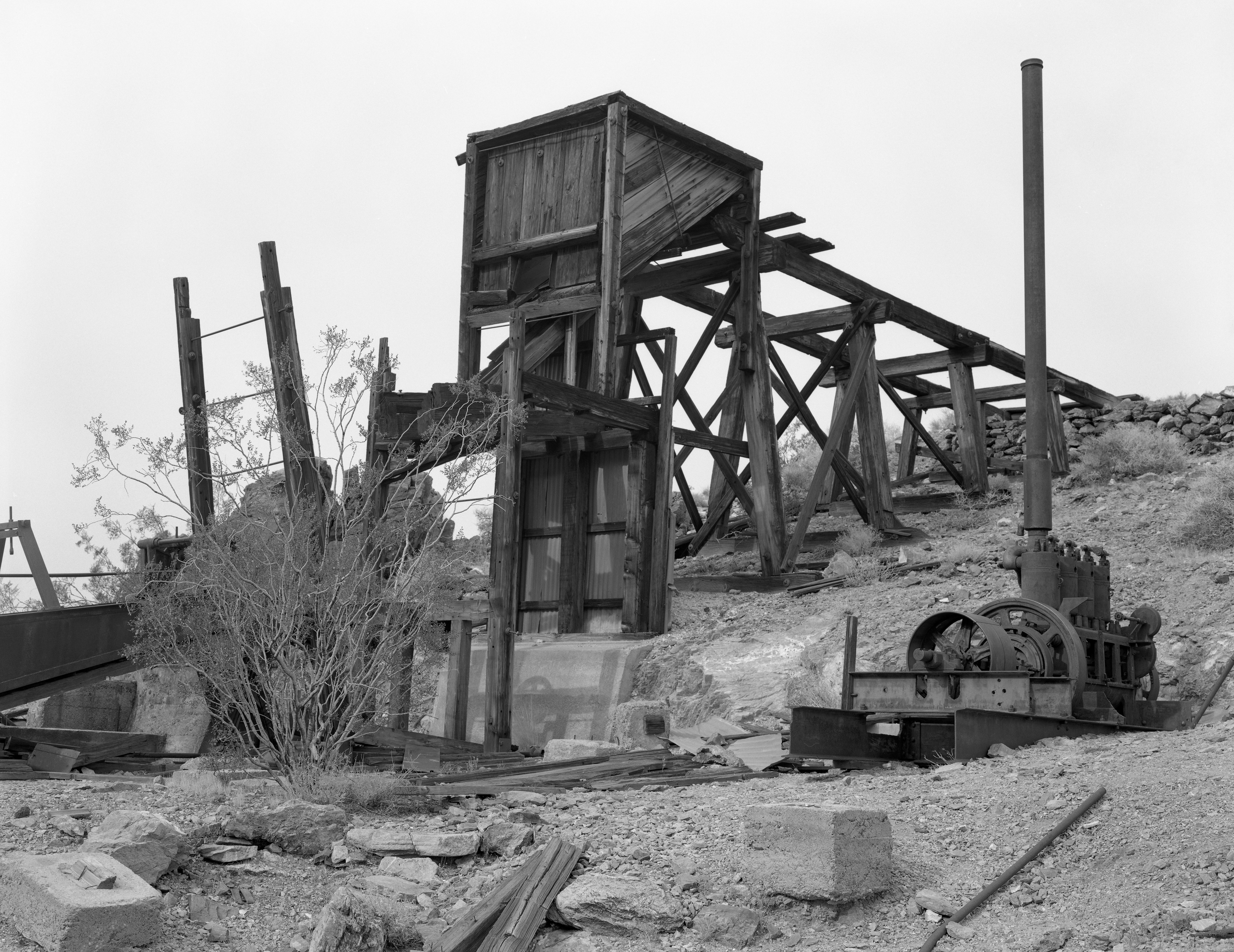
9. Inyo Mine, Echo Canyon
Lynn: Wow, this is very nice! I think the squarish (is that a word?) format works well here. Some gentle sky burning would help. Try to make the print look as good as this transmitted light image!
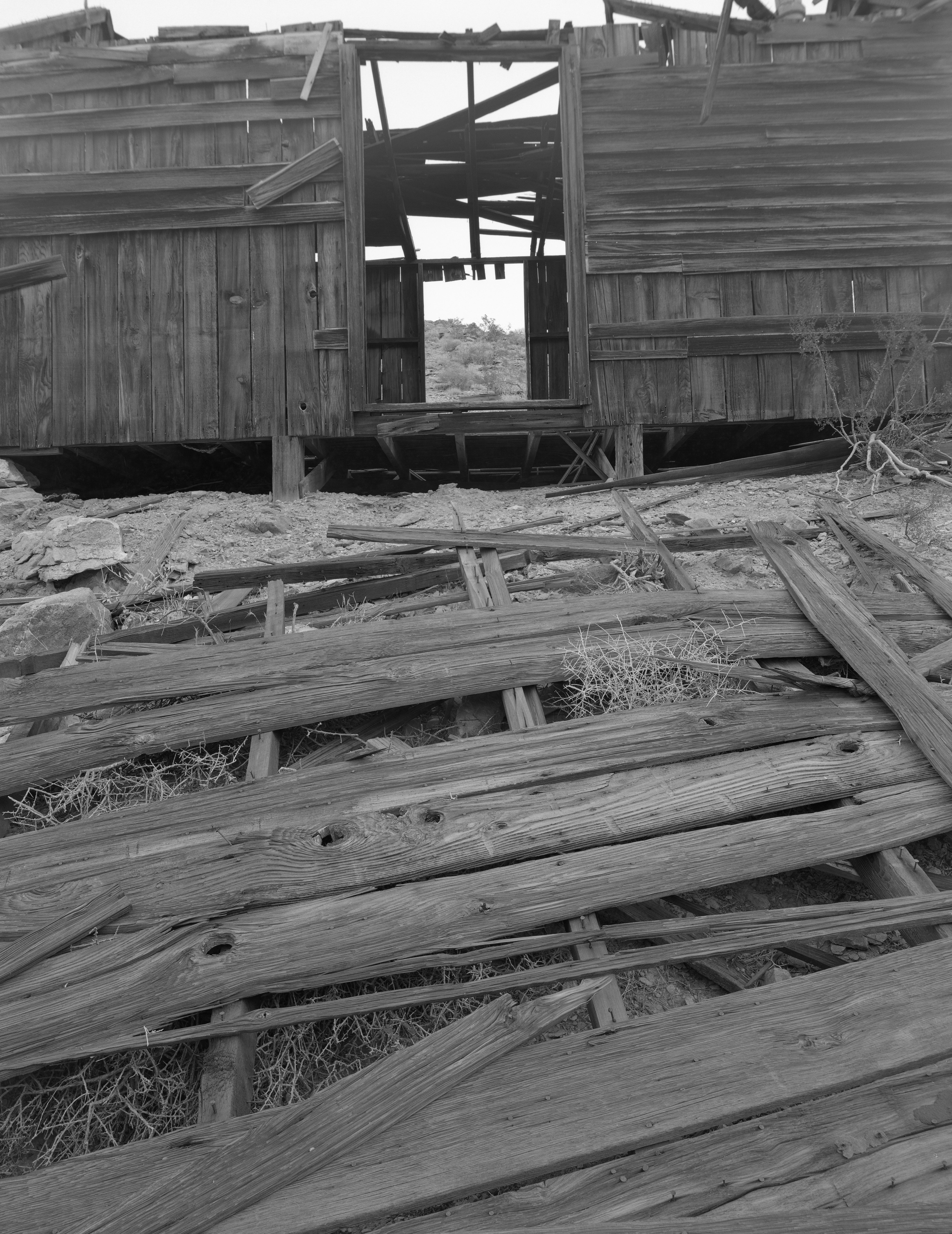
10. Shack, Inyo Mine, Echo Canyon
Lynn: I like this because it reads very well. However like you mentioned to top area isn't sharp and I think that's essential for this image. Also I'd rotate the image a bit so the building door is relatively straight vertical. A SCIM mask could give the foreground boards a very crisp 3D feel, better than what you'd get by simply increasing the paper contrast on the lower half. The SCIM would actually target the cracks in the weathered wood without affecting any midtones or highlights.But you might find the weathered wood looks good as is, without masking.
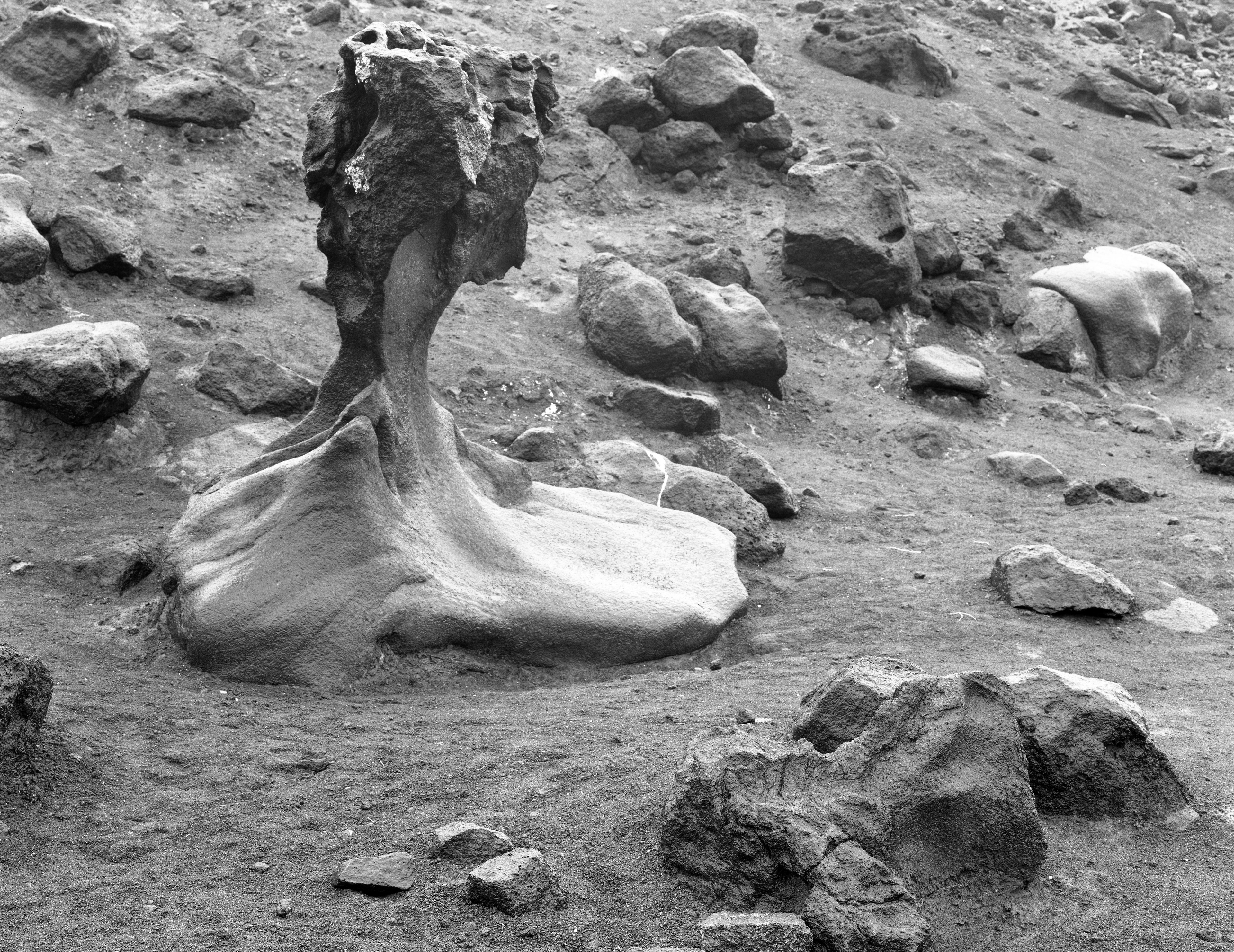
11. Mushroom Rock
Lynn: Nice! You could burn the bright areas around the rock (ground, etc.) with a very soft filter, or use very slight burning with a Fog Mask (type 1). This would kill any competing highlights and help Mushroom Rock to stand out even more, Great job on this - during the rain!
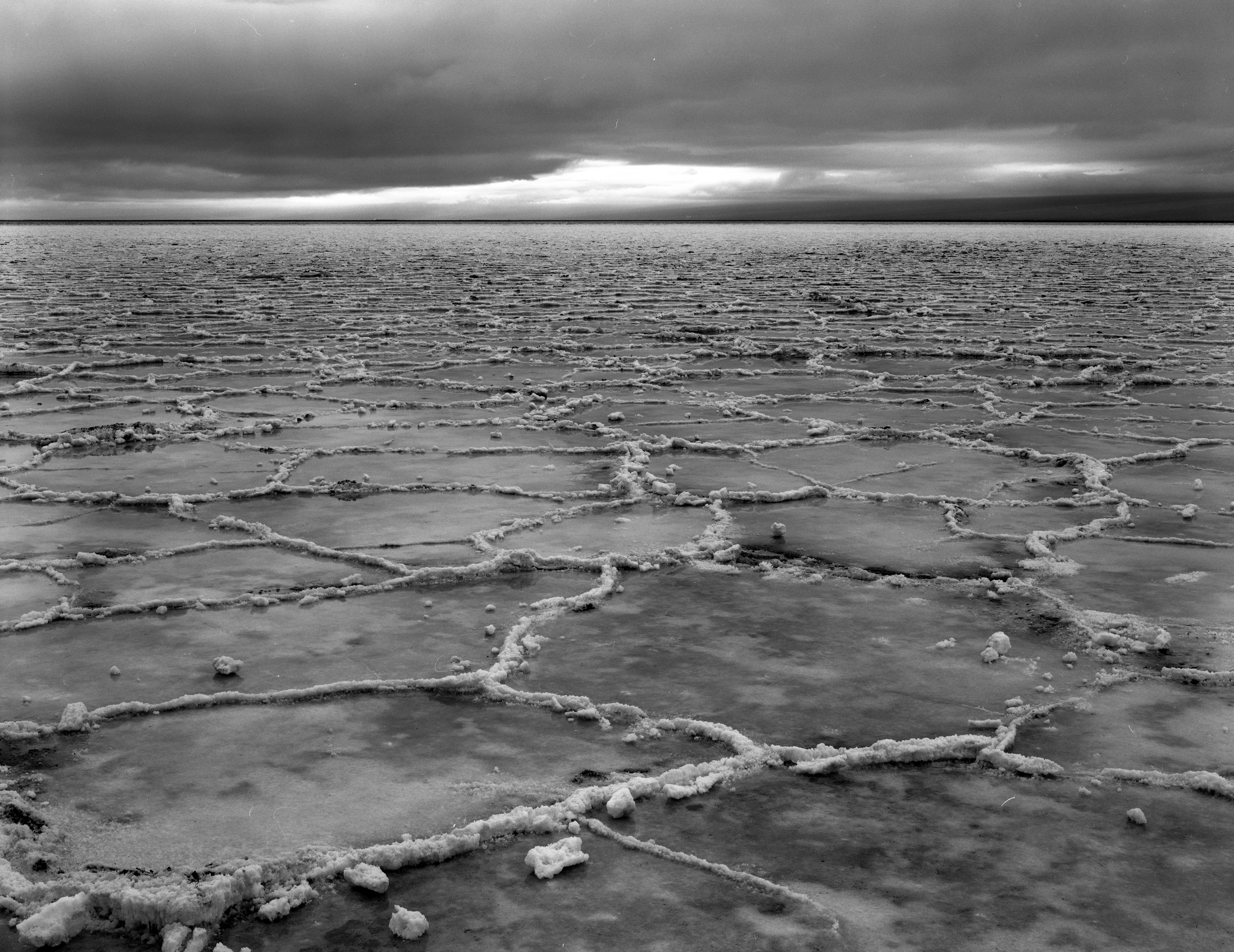
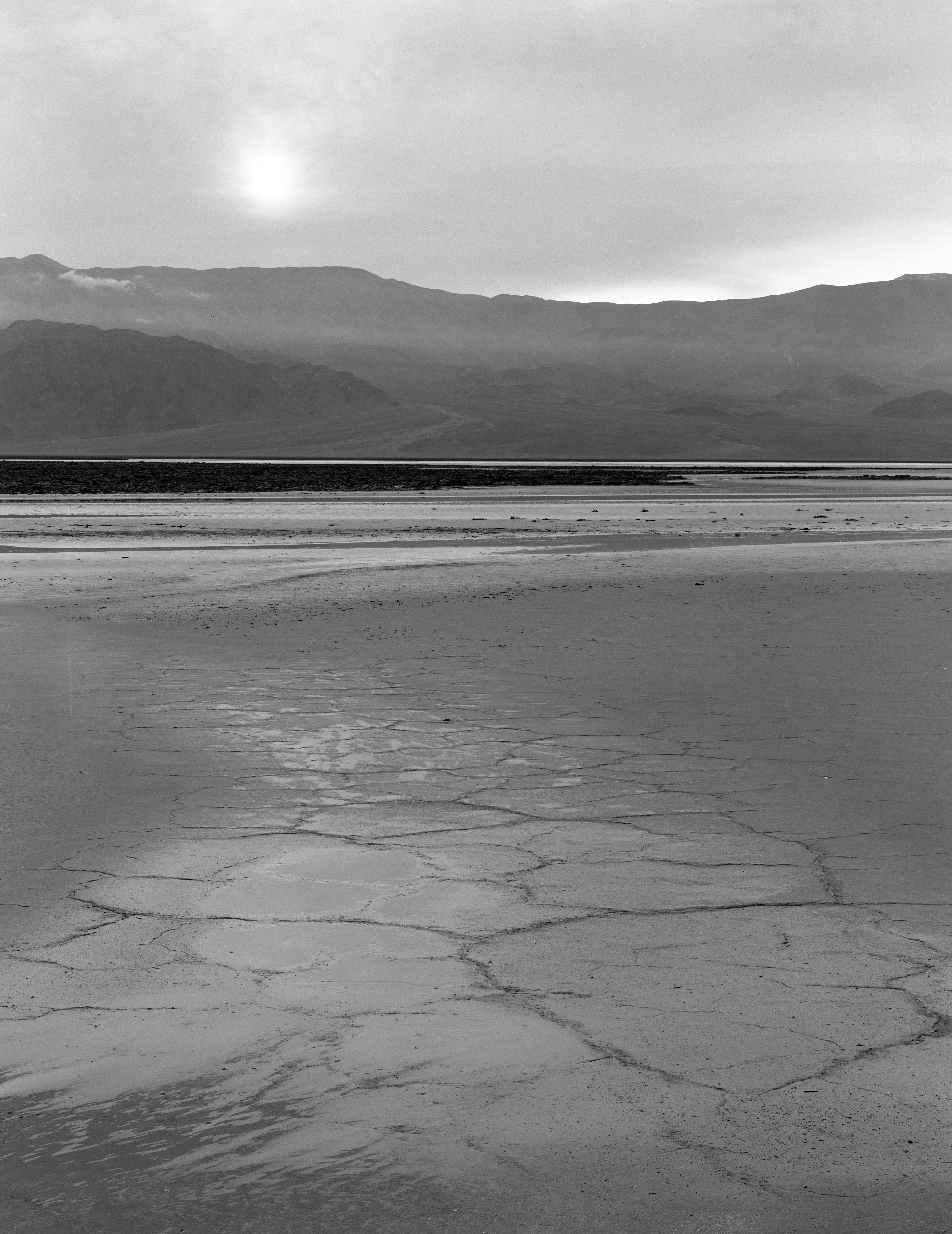
12. Badwater 1
Lynn: I like this better than #13 although the foreground composition would be better (for me) if the crust patterns were more symmetrical.

13. Badwater 2
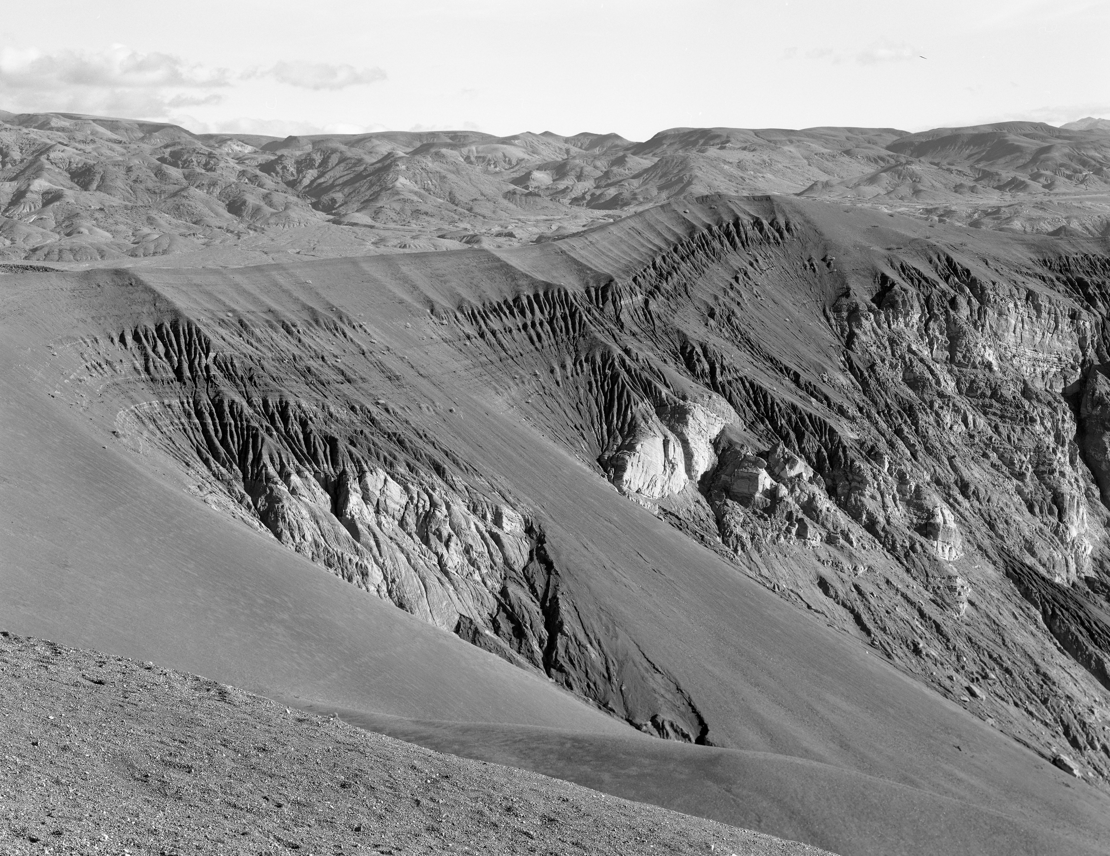
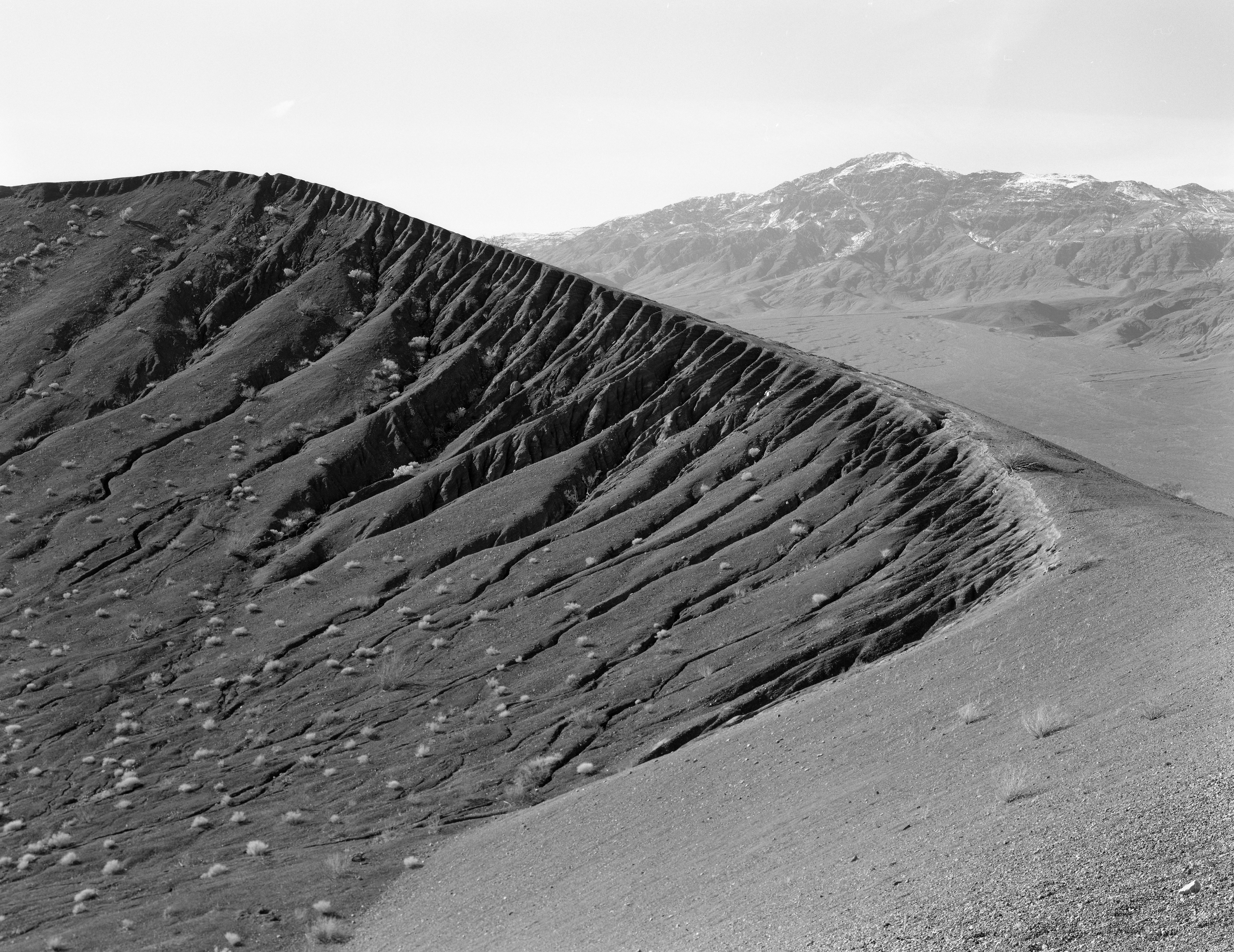
14. Ubehebe Crater 1
Lynn: Good. Maybe feather-burn the top sky just a little and darken the foreground slope at the bottom left.
15. Ubehebe Crater 2
Lynn: I'd crop from the top and bottom to emphasize the shapes. A highlight mask (pin-registered) could be used to accentuate the brightness of the bushes without affecting any other areas.
16. For Edward Weston
Lynn: This is a stunning shot! If it were in total shade it might be better but you could burn some sunlit cinder areas with a low contrast filter or, more precisely, with a fog mask. Very nicely organized! Like good music, not a single note is misplaced!
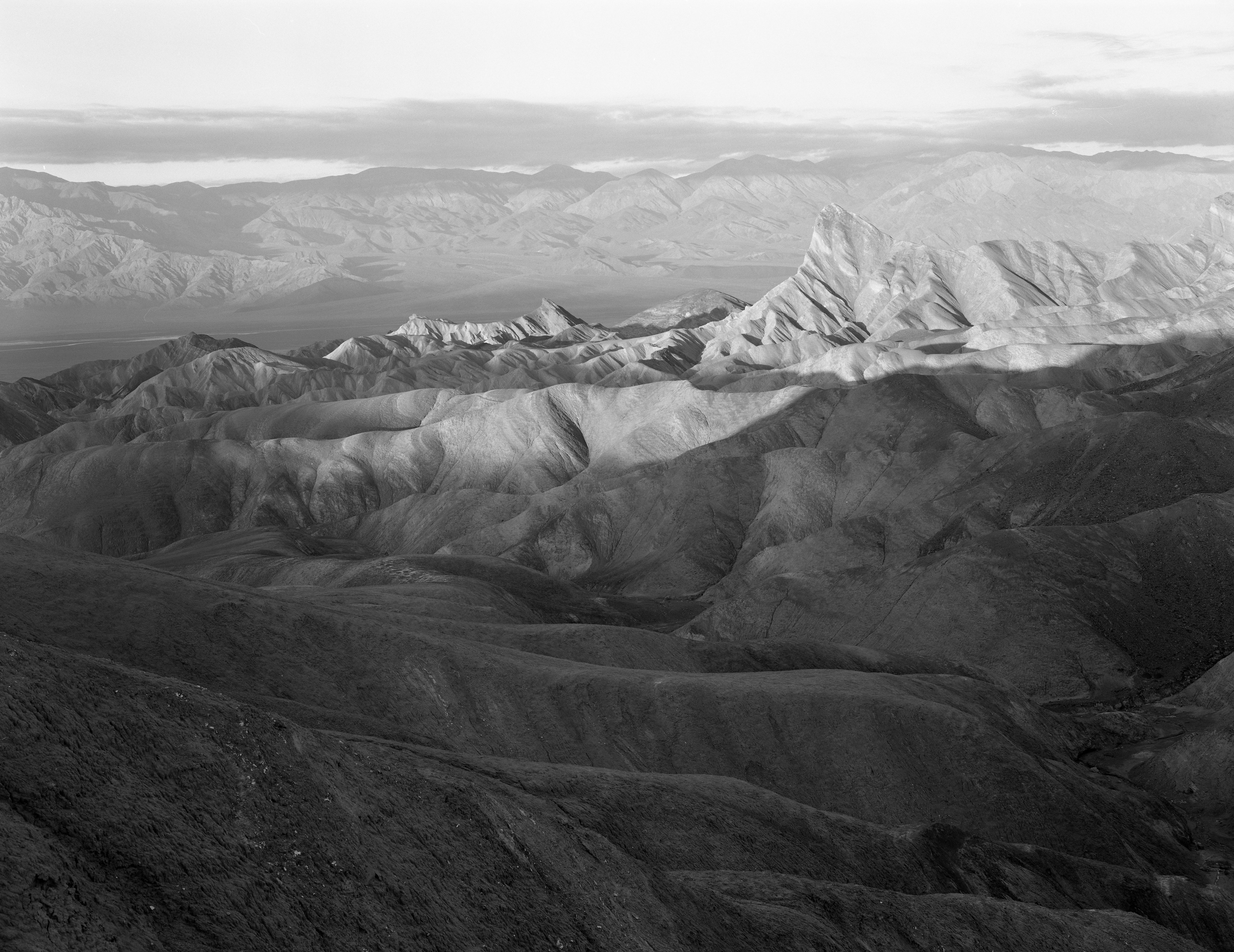
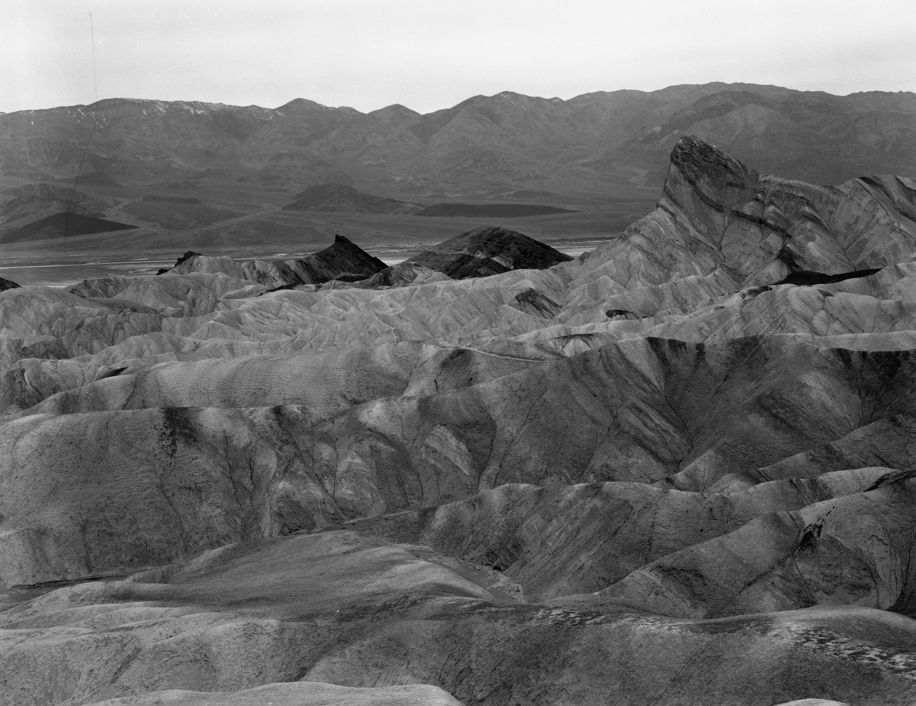
17. Manly Beacon, Zabriskie Point 1
Lynn: I love the inclusion of the foreground diagonal hills, which I think I would emphasize by judicious dodging. Perhaps increase contrast a little overall. Crop top and bottom a little.
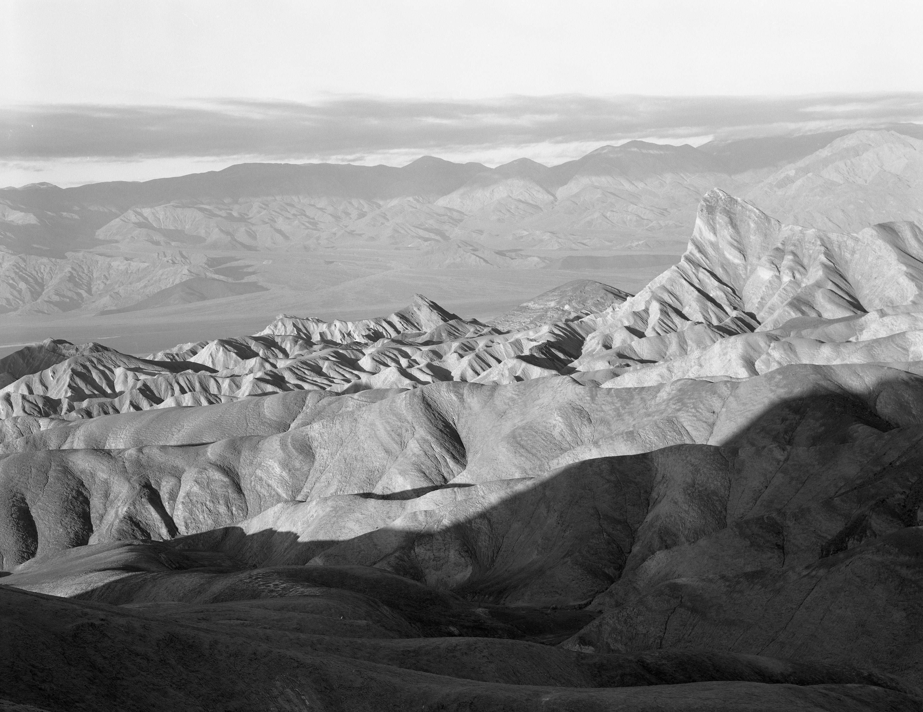
18. Manley Beacon, Zabriskie Point 2
Lynn: The shadows of this image aren't as graceful as #17.
19. Manly Beacon, Zabriskie Point 3
Lynn: Good as is, maybe darken the sky towards the top edge a little. This is a standard image so you can try various methods, such as masking, to make it more unique. Also tilt the image slightly clockwise.
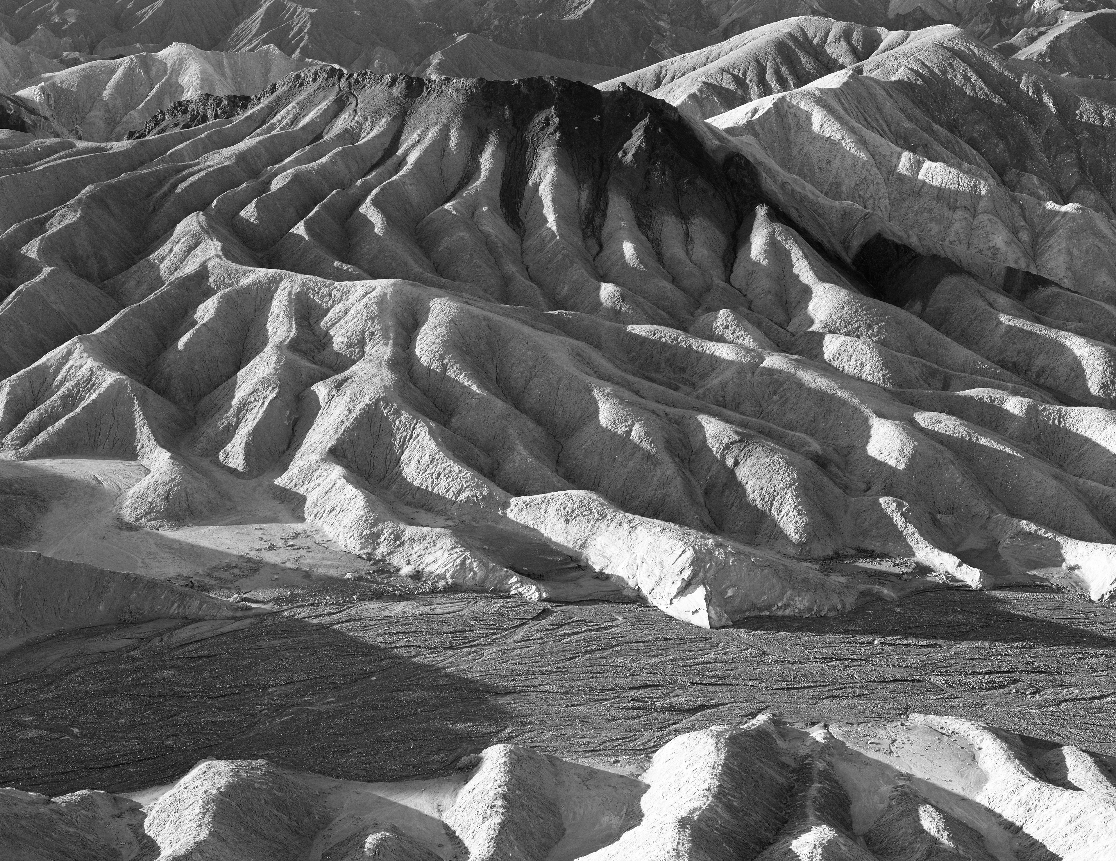
20. Zabriskie Point 1
Lynn: Another standard image but would make a beautiful rich print!
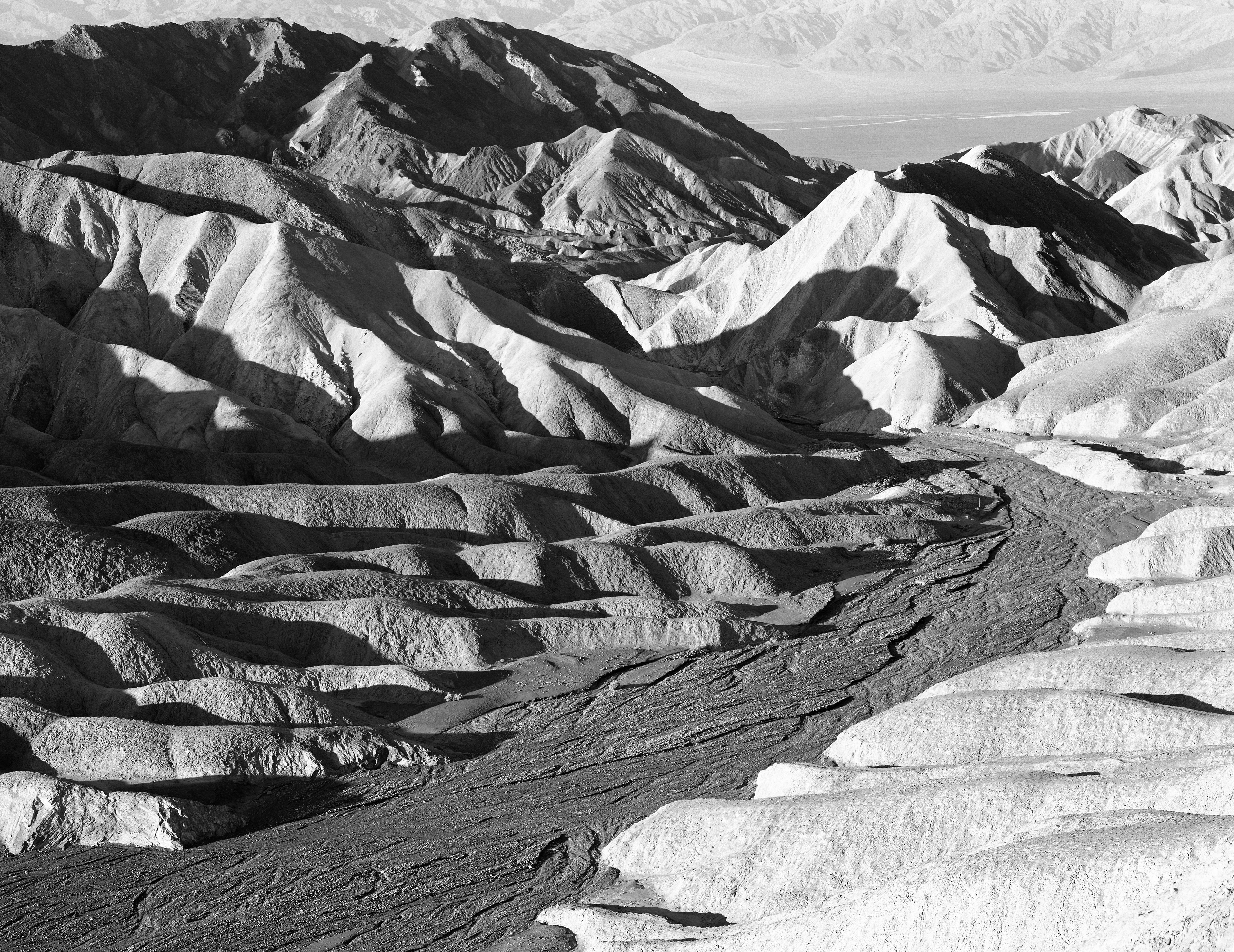
21. Zabriskie Point 2
Lynn:
Standard image but would make a great print.
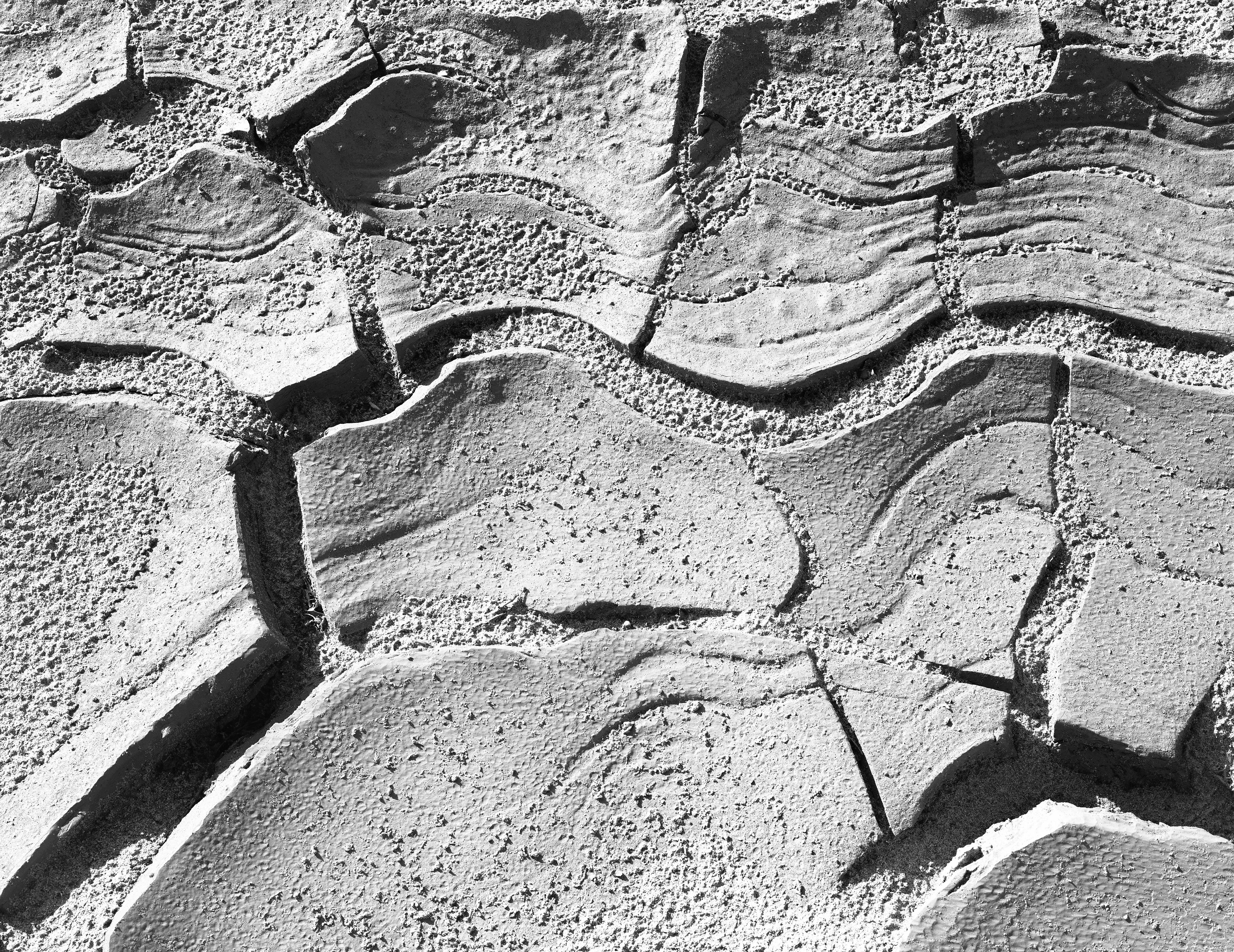
22. Mud, Death Valley
Lynn: I like it but wish the camera wasn't quite as close. Would love to see more left and right sides. You could play with the crop a little, maybe crop up from the bottom a bit. Burn hot area a little, bottom center. You can try printing this much softer overall, then use a SCIM to target only the desired dark cracks.
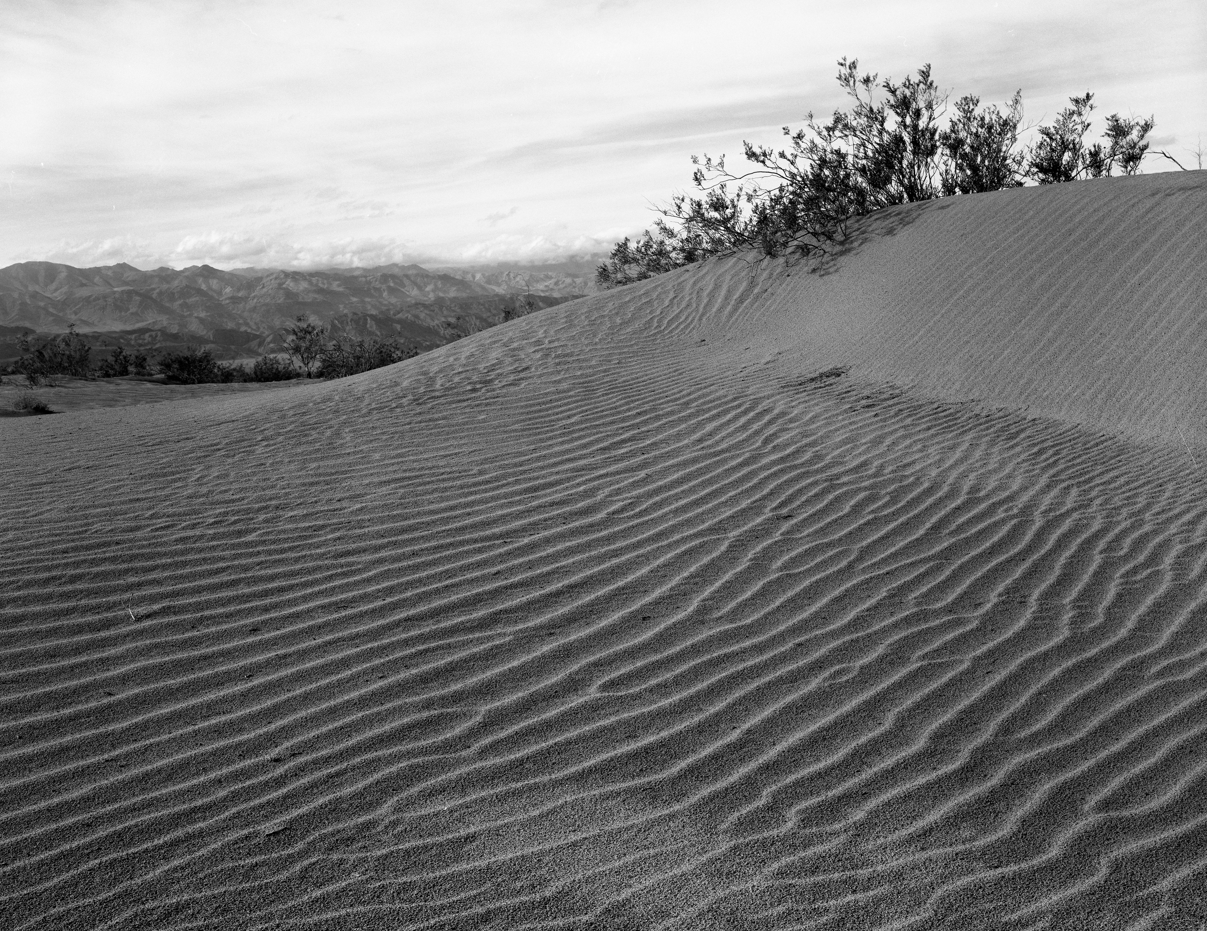
23. Dune, Death Valley
24. Cottonwood Canyon 1
Lynn: #24 and #25: The vertical crop is interesting but I don't like seeing the main diagonal bright rock form cut off at the top edge.
25. Cottonwood Canyon 2
26. Mud and Rock, Death Valley
Lynn: Very interesting! You can burn down (with lower contrast and/or with a Fog Mask) all areas except the rivulet so that the curved cracked mud rivulet really shines!
27. Ash and Panamints Range
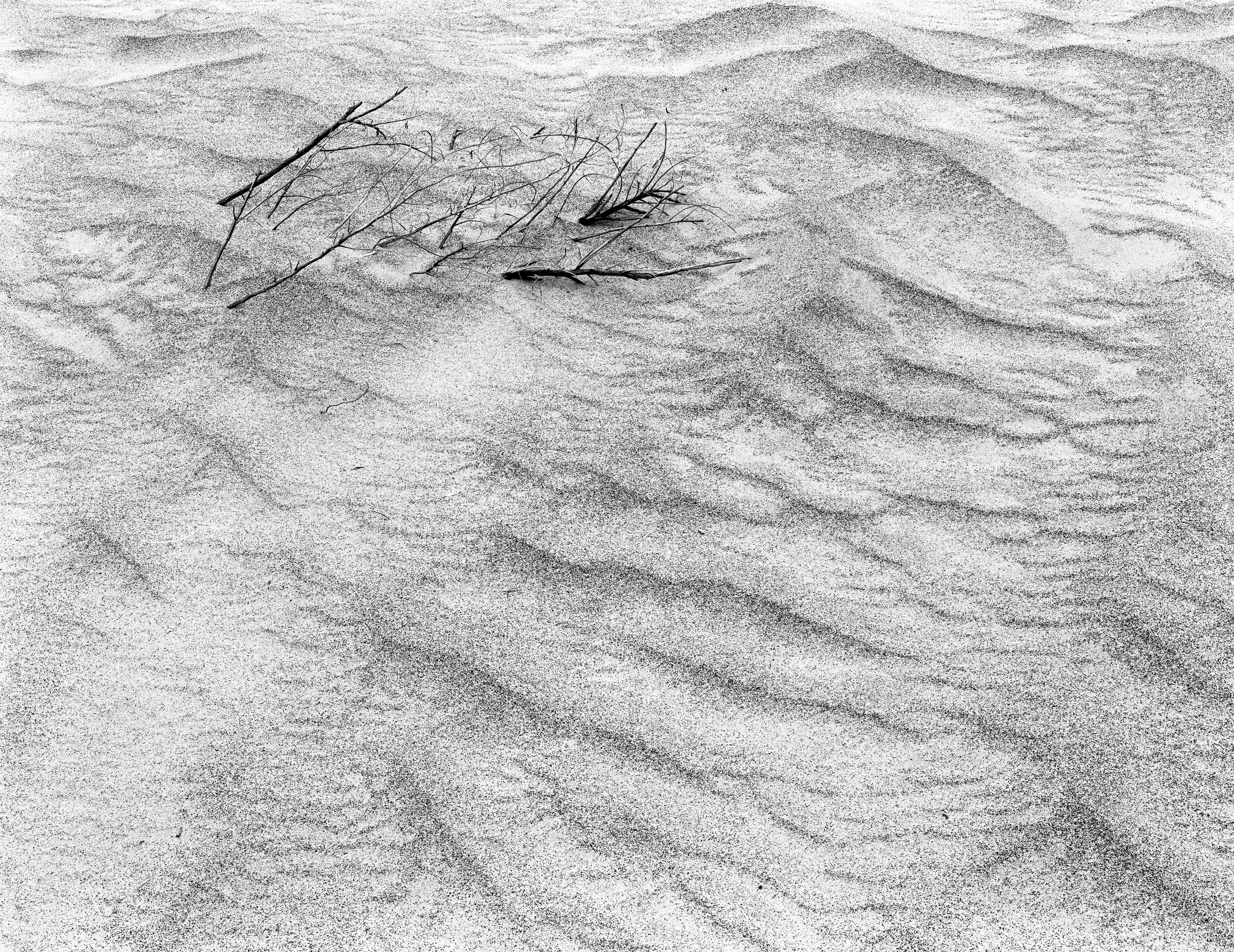
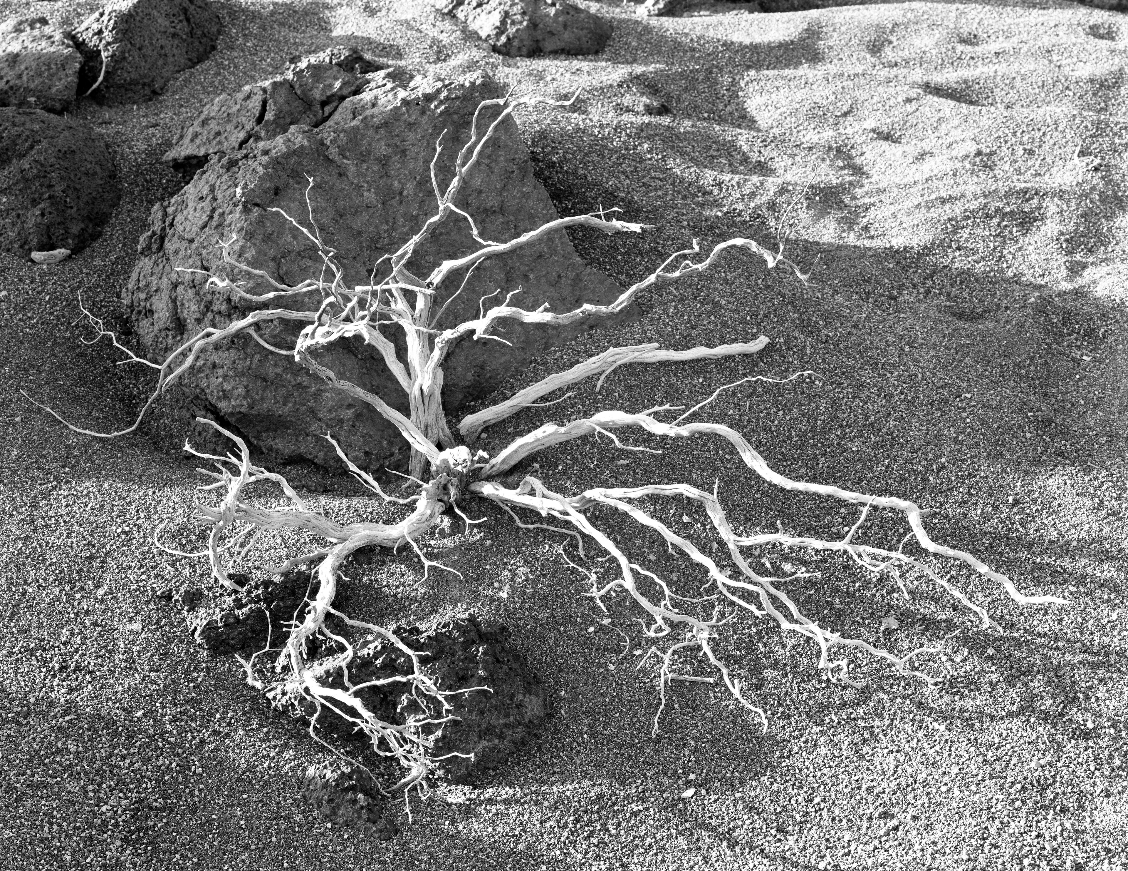
28. Twigs and Sand
Lynn: Very nice! Darken all edges and that's it! Maybe lower the contrast a little.
29. Sun and Mud, Death Valley
Lynn: Fantastic! Print the bottom 2/3 with 1 or 2 grades higher contrast to make the mud shine!